We live in a space jammed with visual images, a daily overdose of sound n visuals. In industrial societies, most people spend much of their time looking at television screens, Web graphics, print illustrations, and other types of visual displays (Messaris, 2001). Because of this, many would argue that we need a more visually oriented educational system, one focused more directly on “visual literacy” -- which may be defined, for our purposes, as competence in the production and consumption of visual messages. Even in movies a lot of effort is put into animation and VFX.
There is also a widespread belief that young people today are highly knowledgeable about visual media as a result of growing up on a steady diet of TV shows, video games, computer images, movies, and, of course, advertisements. If kids are indeed becoming more “media savvy,” do arguments for visual education lose their force? Is the introduction of visual media into our schools redundant and futile?
There are at least two good reasons to be skeptical about claims that young people acquire significant visual skills through mere exposure to television or other visual media. To begin with, one should not take for granted that a preference for visual entertainment is necessarily accompanied by superior understanding of visual information. When MTV was still a novelty, it was often remarked that young viewers seemed to be much more comfortable with MTV-style editing in videos or commercials than were older viewers. The fast paced, jump cuts n white flash kind of editing style is not understood or absorbed by youngsters, the adults were more receptive to this kind of style..it was revealed in a statistical study...!!
We will address these questions by examining some examples from a feature-length movie made by college students. Produced in my Visual Communication Laboratory at the University of Pennsylvania, this comedy-thriller, titled Grad-School B-Movie, was shot and edited by students who had not had any previous film-making experience. The points made below are illustrated with images taken directly from the movie.
Thinking in Pictures
One of the most important things that novice film makers need to learn is to go beyond the literal content of images. The meaning of an image is not just a matter of the people or places that appear in it, or the action that it depicts. How those people or places or actions are portrayed -- in close-up or long shot, in balanced or asymmetrical compositions, in high-key or low-key lighting, etc. -- are essential ingredients of the creation of visual meaning.
As Rudolf Arnheim (1969) argued in his pioneering study of visual intelligence, to learn to think in pictures is to learn how to use these ingredients effectively as elements of one’s overall message. Among inexperienced film or video makers there is a very strong tendency to compose every image as if it were a snapshot. If there is a single person in the image, he or she is framed dead center; if there are two people, they are framed symmetrically and at equal distances from the viewer. It can be argued that this type of composition is based on the way in which people tend to orient themselves toward one another in real life. However, as a quick glance at almost any professionally produced movie or TV show will demonstrate, this is not the way most images are framed by professional directors and cinematographers.
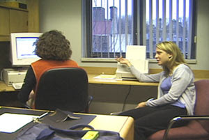
An example from Grad-School B-Movie illustrates this difference. In the scene, Natasha, one of the movie’s three female protagonists, is talking to her office mate, Elsa. As the scene progresses, Natasha learns that she has made a mistake that may have serious consequences. When this scene was rehearsed, the two women were placed at equal distances from the camera, and Natasha, who is working at her computer at the beginning of the scene, was facing away from the viewer (Image 1). However, in the scene as it appears in the movie, this composition was altered radically. Natasha, who was now shown working on a laptop, was placed much closer to the viewer, facing forward rather than backward (Image 2).
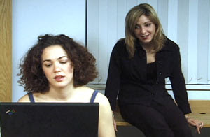
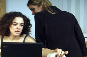
Although the dialogue remained exactly the same in both cases, the visual composition in the final filmed version produced a fairly substantial shift in emphasis. The fact that Natasha’s image is now much larger highlights her status as the principal character and focuses the viewer’s attention on her reactions. These two ingredients -- image size and orientation -- were also used, together with color, to underscore Natasha’s plight at the end of the scene. As Natasha realizes her mistake, Elsa moves forward and casually sits on the edge of her desk, facing away from the viewer and blocking much of the image with her body (Image 3). Natasha’s face is confined to a small section of the frame, between the black laptop and Elsa’s black-clad figure -- graphic representations of the fact that Natasha may have stepped into a trap.
Spatial Intelligence
Although the acquisition of visual literacy is valuable in and of itself, it is worth noting that the intellectual benefits of a visual education often extend beyond the realm of visual media as such. As students become more fluent in creating and combining images, they also develop certain broader mental aptitudes that these activities bring into play. This connection between visual creativity and general cognition has been explored extensively in the well-known work of Howard Gardner (1983), who used the term “spatial intelligence” as an encompassing label for the kinds of mental skills that are cultivated by working in visual media.
Spatial intelligence is the process of forming mental representations of three-dimensional reality as a basis for understanding one’s environment and interacting with it effectively. It is a type of intelligence crucial for success in professions such as architecture or carpentry, but it is also a vital ingredient of any person’s everyday physical activities. What role does it play in visual media?
An example from Grad-School B-Movie illustrates one of the most common situations in which film makers are called upon to exercise their spatial intelligence. This scene begins romantically, as a young woman and her boyfriend take a leisurely stroll across a college campus, ending up at a secluded lakeside. However, as the scene progresses, a sinister note obtrudes, and it eventually becomes clear that the couple is being followed by a mysterious woman who had been spying on them earlier in the movie.
Because of scheduling difficulties, this scene had to be filmed on two occasions: one shoot was devoted mainly to the mystery woman, the other to the romantic couple. Consequently, in the final edit it was impossible to show all three characters together in a single shot. Instead, an illusion of coherent space, time, and action had to be created through editing -- a task required for any scene involving more than one shot but made specially complex in this case by the absence of group shots and the fact that the filming took place in different locations.
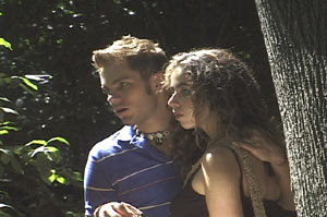
In dealing with such situations, film makers can draw on a variety of devices for linking one shot to another and to the scene as a whole. In the first shot in our example, we see the young woman and her boyfriend standing by the lake, looking pensively at the tranquil scene that surrounds them. Our view of the couple is from the side, and the camera is hand-held, making the image somewhat shaky (Image 4). To an experienced film viewer, the sudden appearance of a shaky, hand-held shot in a scene in which all previous shots are smooth (the camera had been mounted on a tripod) serves as a fairly clear visual cue. It signifies that this is a “subjective” shot -- it represents the point of view of a character inside the world of the movie. In other words, this shot tells the viewer that someone is watching.
Consequently, when shot number 2, a close-up of a woman, appears on the screen, the viewer is already primed to assume that this is the person who is looking at the couple (Image 5). This assumption is reinforced by the woman’s off-screen glance, which serves as a further link between the two shots, placing both the woman and the couple in the same space and time frame, even though she and they do not appear together in either shot.
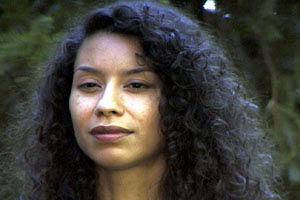
Next we get a close-up view of the couple from the front (Image 6).
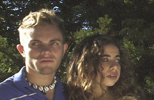
They are both looking off-screen, in different directions. Here the experienced viewer should automatically make a spatial connection between the orientation of these looks and the spatial layout that was implied by the first two shots, leading to the conclusion that the younger woman has caught a glimpse of the mystery woman off to the side. This conclusion is also suggested, of course, by the hint of a troubled expression on the actress’s face. Therefore, when the mystery woman appears again in a subsequent shot, looking straight into the camera, the viewer can infer that this is another subjective shot, this time from the younger woman’s perspective (Image 7).
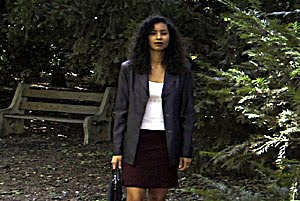
This kind of connection between shots should happen spontaneously, without much conscious reflection, in the minds of experienced viewers. However, making sure such connections work properly requires considerable planning on the part of film makers and editors, and there is good evidence that this part of the film-making process can bring about an enhancement of students’ spatial intelligence. In research on the relationship between film-production experience and cognitive skills, it is editing in particular that appears to lead to the most substantial gains in spatial intelligence (Tidhar, 1984).
One of the things that separate 'good' directors from 'great' ones is
the ability to visualize the scenes and shots of their movie before
they even shoot the first take. Cast and crew appreciate this ability
in a director because it means the director won't waste a lot of time
on takes that will never end up in the movie. If a director knows what
he or she wants to shoot, it also helps immensely in communicating
their needs effectively to the cast and crew- another hallmark of a
professional director.
One way that is used extensively in the film industry to visualize
scenes is to storyboard them. Typically, straightforward scenes such
as a simple exchange of dialog between two characters will not need
storyboarding. Complicated or action-packed scenes on the other hand,
will often need extensive storyboarding in order to ensure that all
the required shots have been gotten, and also in order to effectively
communicate the scene to everyone else on the set.
The good news is that you don't need to be a world-class artist in
order to produce storyboards for your movie. Depending on your needs,
here are three methods to get your vision across using storyboards.
If the only thing you can draw is a stick figure, this is the method
for you. This method is great for a quick discussion on the set when
you need to convey what you want a shot to look like. Draw a square on
a piece of paper... It doesn't have to be perfect. Now ask yourself,
are you talking about a wide shot, a medium shot, a close-up, or a
'specialized' shot (such as an extreme close-up, or a shot from an
unusual angle)? Now draw the character(s) in the box at the proper
height for the shot you're looking for. Remember, just make them
stick-figures- you only need to be able to convey where the characters
are on the screen and how big they will be in the shot.
Next ask yourself if there will be motion in the shot. What kind? Will
the characters move? Will the camera move? Both? Draw a second box and
sketch how you want the shot to look when you cut the shot. Again,
keep it simple, don't try to draw everything in your shot- just the
items that will be moving, and the camera movement.. Don't look now,
but you've just expressed visually how you want your shot to look.
For all queries contact : anikavi@gmail.com
Wednesday, December 30, 2009
The Shot and The Scene.
The Shot
Shots are the smallest unit of dramatic action in the movie and serve as building blocks for scenes. Each shot must have a purpose in the scene, otherwise it should not be used. Once the shot's purpose is achieved, it is time to cut to the next shot.
A shot must be as short as possible while still achieving its purpose. If it is too long, the audience will be bored; if it is too short, they will be frustrated.
A shot must be as short as possible while still achieving its purpose.
Several factors contribute to determining proper shot length:
Audience Expectation - In most cases the editor cuts to a new shot simply because the audience expects it. The audience may need to get closer, further away or angled differently to see the action. Audience expectation works on a subliminal level. Still, if the expectation is not met they will feel it and react negatively.
For example, if a character is injured in wide shot, the audience will want to see a close-up in order to clarify what happened. If the first shot drags on too long, it will frustrate the audience and possibly impede their understanding the action. Running a shot too long is common error with novice filmmakers.
Comprehension - Shots require various viewing times for the audience to comprehend them. Simple compositions, static subjects, and shots similar to their predecessor need minimal screen time for comprehension. On the other hand, complicated compositions, moving subjects, and shots vastly different than their predecessor need more screen time. Despite this, the speed with an audience can absorb the meaning and purpose of a shot should not be underestimated.
Don't underestimate how quickly the audience can absorb the meaning of a shot.
Action Requirements - Some shots contain an action that must be completed before cutting to the next shot. If the action is too long to hold audience interest, you should compress it using the techniques discussed later in the course.
Editor Imposed - In the above situations, the editor determines shot length based on audience needs. Occasionally, the editor will impose a cut to create a response in the audience. This can be to: create emphasis, maintain rhythm, jar the audience, or make a symbolic point.
The Scene
Just as shots are the building blocks for scenes, so are scenes the building blocks for the overall movie. Each scene must move the story forward in a significant way. Ideally, it should unfold like a story in miniature, with a beginning, middle and an end. Obviously, this will not be the case all the time, particularly with transitional scenes.
Scenes should unfold like a miniature story, with a beginning, middle and end.
When constructing a scene, it is essential to consider how it fits into the overall story. Specifically, you should consider the:
objectives of the scene within the story
objectives of the characters within the scene
scene to scene rhythm
You are not limited to a single time period or location when constructing scenes, rather, you can choose from three designs: continuous action, parallel action and montage. Each design is characterized by a progressive loosening of the time/space continuum.
here's an example for a scene with shots listed..
For all queries contact : anikavi@gmail.com
Use of Camera
Camera Use
A camera - whether it is video or still, digital or film, attached to a computer or a phone - is basically a box designed for trapping light. It can be as simple as a cardboard box with a pinhole punched in it or as elaborate as those on a space telescope. Whatever the design, its purpose is to record patterns of light and shadow and colour, for future reference.
When you use a camera you are trapping images. There are many similarities between the language used for hunting and the language of photography - shoot, stalk, line-of-sight, capture, pin etc etc. A camera can be a very powerful weapon - especially in war time. Is it a coincidence that Princess Diana (named after the goddess of hunting) was chased to her death by paparazzi?
Selecting Your Shot
Always consider the purpose of a shot before you start to set it up. Fair enough, you've found your subject, but what do you want to show about it/them? If your subject is human - are they wearing the right clothes? Are they in the right mood? Are they doing the right thing in the right place? if your subject is inanimate, think about what it represents, and whether you best communicate that by showing part of it or all of it.
Background
Unless you are using a close up (or plan to crop your photograph very tightly) you need to consider the background of your photograph. Does it match your subject - think colours and textures? Does your subject show up against the background? If there is a mismatch between the two is this for a very specific reason? Does the background give additional information about the subject? What mise-en-scène will be included in your image?
By carefully considering the relationship between background and subject you can make your images much more powerful.
Light
Light creates your image - use it wisely. As a general rule, the light should be behind you NOT behind your subject i.e. never stand your subject in front of a window. Remember that light has two purposes - to reveal and to create shadows, which hide. Make sure that whatever you want to show is bathed in plenty of bright light.
The time of day and the weather conditions when you are filming/photographing will have an effect on your images. Whilst most digital cameras (video and still) cope reasonably well in low lighting conditions your images will still turn out rather dull. The most interesting times of day to capture an image are early morning and late afternoon - the angle of sunlight creates some very interesting shadows and the light (if it is not too polluted) has a soft quality. If you have a choice, always try to photograph an outdoor subject at these times.
Also remember that artificial (i.e. indoor) light will give your pictures an orange cast unless you take steps to correct it. Your camera may have an indoor or incandescent bulb setting that will do this for you.
Getting The Perfect Shot
Looking through the lens
Pointing your camera and looking through the lens is just the beginning of the process. You will need to consider carefully the angle that you choose, as well as selecting what will and what will not be in your image. One of the most underused pieces of photography equipment is feet - try moving around and seeing what effect a different perspective has on your image - take pictures from different angles.
Composition
The composition of an image is simply what it is made up of. An image will display a series of objects or people, and when referring to its composition we look at their arrangement within the picture. Often we infer meaning through objects' relationships with each other. Is one depicted as larger? More central? Better lit? How much space is there separating the objects?
Images are usually composed around the 'rule of thirds'.
* Clear Introduction to Rule of Thirds in photography
* Positive and Negative Space - an artist writes
Apart from arranging objects within the picture, another decision that is made in composition is focus, or depth of field. This dictates the depth into the picture in which objects are in clear focus. You may becide to blur out the background, in order to place more emphasis on central or foreground objects. or you may decide to have everything in your picture in equal focus, for instance in a landscape shot, or a group photo.
Framing
Framing — deciding where an image begins and ends — is as vital to the meaning of an image as composition. There are a whole variety of camera angles which can be selected to frame a shot (see left button bar), and often what is left out is as important as what is included. What is beyond the picture, for instance, what could a model be looking at, is the source of much ambiguity and enigma. We infer meaning from the relationship between the camera and subject (a close up is intimate, a long shot implies emotional distance or major status difference).
By framing two objects together in the same image, we imply a connection between them, especially if there is a physical link, perhaps through a graphic or colour, between them. By isolating an object within the frame - for instance showing a swimmer against an expanse of nothing but sea - we can make it seem insignificant and lonely.
Compare these two pictures, of the Seattle Space Needle, taken from exactly the same angle within a second or so of each other.
The angle hasn't changed but the framing is very different.
A zoom lens has been used so that the Needle on the right is framed by the buildings lower down,and the clouds around it, giving a sense of context. We can tell it's a very tall building, whereas the first shot compresses the height and makes the top seem closer to the photographer.
Perhaps the most well know principle of photographic composition is the ‘Rule of Thirds‘.
It’s one of the first things that budding digital photographers learn about in classes on photography and rightly so as it is the basis for well balanced and interesting shots.
I will say right up front however that rules are meant to be broken and ignoring this one doesn’t mean your images are necessarily unbalanced or uninteresting. However a wise person once told me that if you intend to break a rule you should always learn it first to make sure your breaking of it is all the more effective!
What is the Rule of Thirds?
The basic principle behind the rule of thirds is to imagine breaking an image down into thirds (both horizontally and vertically) so that you have 9 parts. As follows.
As you’re taking an image you would have done this in your mind through your viewfinder or in the LCD display that you use to frame your shot.
With this grid in mind the ‘rule of thirds’ now identifies four important parts of the image that you should consider placing points of interest in as you frame your image.
Not only this – but it also gives you four ‘lines’ that are also useful positions for elements in your photo
The theory is that if you place points of interest in the intersections or along the lines that your photo becomes more balanced and will enable a viewer of the image to interact with it more naturally. Studies have shown that when viewing images that people’s eyes usually go to one of the intersection points most naturally rather than the center of the shot – using the rule of thirds works with this natural way of viewing an image rather than working against it.
In addition to the above picture of the bee where the bee’s eye becomes the point of focus here are some of examples:
In this shot I’ve placed the subject along a whole line which means she is considerably off center and therefore creating an additional point of interest. Placing her right in the center of the frame could have resulted in an ‘awkward’ shot.
In a similar way a good technique for landscape shots is to position horizons along one of the horizontal lines also as I’ve done with the following shot (I’ll let you imagine the lines).
Using the Rule of Thirds comes naturally to some photographers but for many of us takes a little time and practice for it to become second nature.
In learning how to use the rule of thirds (and then to break it) the most important questions to be asking of yourself are:
* What are the points of interest in this shot?
* Where am I intentionally placing them?
Once again – remember that breaking the rule can result in some striking shots – so once you’ve learnt it experiment with purposely breaking it to see what you discover.
Lastly – keep the rule of thirds in mind as you edit your photos later on. Post production editing tools today have good tools for cropping and reframing images so that they fit within the rules. Experiment with some of your old shots to see what impact it might have on your photos.
Read more: http://digital-photography-school.com/rule-of-thirds#ixzz0bDokvBTr
Camera Shots, Angles and Movement.
Camera Angles
The relationship between the camera and the object being photographed
(ie the ANGLE) gives emotional information to an audience, and guides
their judgment about the character or object in shot. The more extreme
the angle (ie the further away it is from eye left), the more symbolic
and heavily-loaded the shot.
1. The Bird's-Eye view
This shows a scene from directly overhead, a very unnatural and
strange angle. Familiar objects viewed from this angle might seem
totally unrecognisable at first (umbrellas in a crowd, dancers' legs).
This shot does, however, put the audience in a godlike position,
looking down on the action. People can be made to look insignificant,
ant-like, part of a wider scheme of things. Hitchcock (and his
admirers, like Brian de Palma) is fond of this style of shot.
Cameraman gets a high angle shot
A cameraman, raised above the action, gets a high angle shot
2. High Angle
Not so extreme as a bird's eye view. The camera is elevated above the
action using a crane to give a general overview. High angles make the
object photographed seem smaller, and less significant (or scary). The
object or character often gets swallowed up by their setting - they
become part of a wider picture.
3. Eye Level
A fairly neutral shot; the camera is positioned as though it is a
human actually observing a scene, so that eg actors' heads are on a
level with the focus. The camera will be placed approximately five to
six feet from the ground.
4. Low Angle
These increase height (useful for short actors like Tom Cruise or
James McAvoy) and give a sense of speeded motion. Low angles help give
a sense of confusion to a viewer, of powerlessness within the action
of a scene. The background of a low angle shot will tend to be just
sky or ceiling, the lack of detail about the setting adding to the
disorientation of the viewer. The added height of the object may make
it inspire fear and insecurity in the viewer, who is psychologically
dominated by the figure on the screen.
5. Oblique/Canted Angle
Sometimes the camera is tilted (ie is not placed horizontal to floor
level), to suggest imbalance, transition and instability (very popular
in horror movies). This technique is used to suggest POINT-OF-View
shots (ie when the camera becomes the 'eyes' of one particular
character,seeing what they see — a hand held camera is often used for
this.
Camera Movement
A director may choose to move action along by telling the story as a
series of cuts, going from one shot to another, or they may decide to
move the camera with the action. Moving the camera often takes a great
deal of time, and makes the action seem slower, as it takes several
second for a moving camera shot to be effective, when the same
information may be placed on screen in a series of fast cuts. Not only
must the style of movement be chosen, but the method of actually
moving the camera must be selected too. There are seven basic methods:
1. Pans
A movement which scans a scene horizontally. The camera is placed on a
tripod, which operates as a stationary axis point as the camera is
turned, often to follow a moving object which is kept in the middle of
the frame.
2. Tilts
A movement which scans a scene vertically, otherwise similar to a pan.
3. Dolly Shots
Sometimes called TRUCKING or TRACKING shots. The camera is placed on a
moving vehicle and moves alongside the action, generally following a
moving figure or object. Complicated dolly shots will involve a track
being laid on set for the camera to follow, hence the name. The camera
might be mounted on a car, a plane, or even a shopping trolley (good
method for independent film-makers looking to save a few dollars). A
dolly shot may be a good way of portraying movement, the journey of a
character for instance, or for moving from a long shot to a close-up,
gradually focusing the audience on a particular object or character.
4. Hand-held shots
The hand-held movie camera first saw widespread use during World War
II, when news reporters took their windup Arriflexes and Eyemos into
the heat of battle, producing some of the most arresting footage of
the twentieth century. After the war, it took a while for commercially
produced movies to catch up, and documentary makers led the way,
demanding the production of smaller, lighter cameras that could be
moved in and out of a scene with speed, producing a "fly-on-the-wall"
effect.This aesthetic took a while to catch on with mainstream
Hollywood, as it gives a jerky, ragged effect, totally at odds with
the organised smoothness of a dolly shot. The Steadicam (a heavy
contraption which is attached a camera to an operator by a harness.
The camera is stabilized so it moves independently) was debuted in
Marathon Man (1976), bringing a new smoothness to hand held camera
movement and has been used to great effect in movies and TV shows ever
since. No "walk and talk" sequence would be complete without one. Hand
held cameras denote a certain kind of gritty realism, and they can
make the audience feel as though they are part of a scene, rather than
viewing it from a detached, frozen position.
5. Crane Shots
Basically, dolly-shots-in-the-air. A crane (or jib), is a large, heavy
piece of equipment, but is a useful way of moving a camera - it can
move up, down, left, right, swooping in on action or moving diagonally
out of it. The camera operator and camera are counter-balanced by a
heavy weight, and trust their safety to a skilled crane/jib operator.
6. Zoom Lenses
A zoom lens contains a mechanism that changes the magnification of an
image. On a still camera, this means that the photographer can get a
'close up' shot while still being some distance from the subject. A
video zoom lens can change the position of the audience, either very
quickly (a smash zoom) or slowly, without moving the camera an inch,
thus saving a lot of time and trouble. The drawbacks to zoom use
include the fact that while a dolly shot involves a steady movement
similar to the focusing change in the human eye, the zoom lens tends
to be jerky (unless used very slowly) and to distort an image, making
objects appear closer together than they really are. Zoom lenses are
also drastically over-used by many directors (including those holding
palmcorders), who try to give the impression of movement and
excitement in a scene where it does not exist. Use with caution - and
a tripod!
7. The Aerial Shot
An exciting variation of a crane shot, usually taken from a
helicopter. This is often used at the beginning of a film, in order to
establish setting and movement. A helicopter is like a particularly
flexible sort of crane - it can go anywhere, keep up with anything,
move in and out of a scene, and convey real drama and exhilaration —
so long as you don't need to get too close to your actors or use
location sound with the shots.
Camera Shots
1. Establishing shot: Opening shot or sequence, frequently an
exterior 'General View' as an Extreme Long Shot (XLS). EWS (Extreme Wide Shot)
The view is so far from the subject that she isn't even visible. This is often used as an establishing shot. In the extreme wide shot, the view is so far from the subject that she isn't even visible. The point of this shot is to show the subject's surroundings. Photo 22580
The EWS is often used as an "establishing shot" - the first shot of a new scene, designed to show the audience where the action is taking place.
The EWS is also known as an extra long shot or extreme long show (acronym XLS).
2. VWS (Very Wide Shot)
The subject is visible (barely), but the emphasis is still on placing her in her environment.
The very wide shot is much closer to the subject than an extreme wide shot, but still much further away than a wide shot. The subject is (just) visible here, but the emphasis is very much on placing her in her environment.
This often works as an establishing shot, in which the audience is shown the whole setting so they can orient themselves. The VWS also allows plenty of room for action to take place, or for multiple subjects to appear on screen.
3. Long shot (LS): Shot which shows all or most of a fairly large
subject (for example, a person) and usually much of the surroundings.
Extreme Long Shot (XLS) - see establishing shot: In this type of shot
the camera is at its furthest distance from the subject, emphasising
the background.The subject takes up the full frame, or at least as much as possible. The same as a long shot.
In the wide shot, the subject takes up the full frame. In this case, the girl's feet are almost at the bottom of frame, and her head is almost at the top. Obviously the subject doesn't take up the whole width and height of the frame, since this is as close as we can get without losing any part of her.
The small amount of room above and below the subject can be thought of as safety room - you don't want to be cutting the top of the head off. It would also look uncomfortable if her feet and head were exactly at the top and bottom of frame.
As with most shot types, the wide shot means different things to different people. However the wide shot seems to suffer more from varying interpretations than other types. Many people take the WS to mean something much wider than our example, i.e. what we would call a very wide shot.
3. Medium Long Shot (MLS): In the case of a standing actor, the
lower frame line cuts off his feet and ankles. Some documentaries with
social themes favour keeping people in the longer shots, keeping
social circumstances rather than the individual as the focus of
attention
4. Medium Shot or Mid-Shot (MS). In such a shot the
subject or actor and its setting occupy roughly equal areas in the
frame. In the case of the standing actor, the lower frame passes
through the waist. There is space for hand gestures to be seen.MS (Mid Shot)
Shows some part of the subject in more detail whilst still giving an impression of the whole subject.
The mid shot shows some part of the subject in more detail, whilst still showing enough for the audience to feel as if they were looking at the whole subject.
In fact, this is an approximation of how you would see a person "in the flesh" if you were having a casual conversation. You wouldn't be paying any attention to their lower body, so that part of the picture is unnecessary.
The MS is appropriate when the subject is speaking without too much emotion or intense concentration. It also works well when the intent is to deliver information, which is why it is frequently used by television news presenters. You will often see a story begin with a MS of the reporter (providing information), followed by closer shots of interview subjects (providing reactions and emotion).
As well as being a comfortable, emotionally neutral shot, the mid shot allows room for hand gestures and a bit of movement.
5. Medium Close Shot (MCS): The setting can still be seen. The
lower frame line passes through the chest of the actor. Medium shots
are frequently used for the tight presentation of two actors (the two
shot), or with dexterity three (the three shot).
6. Close-up (CU): A picture which shows a fairly small part of the
scene, such as a character's face, in great detail so that it fills
the screen. It abstracts the subject from a context.
7. MCU (Medium Close-Up): head and shoulders.
MCU (Medium Close Up)
Half way between a Mid Shot and a Close Up. This shot shows the face more clearly, without getting uncomfortably close.
8. BCU (Big Close-Up): forehead to chin. Close-ups focus attention
on a person's feelings or reactions, and are sometimes used in
interviews to show people in a state of emotional excitement, grief or
joy. In interviews, the use of BCUs may emphasise the interviewee's
tension and suggest lying or guilt. BCUs are rarely used for important
public figures; MCUs are preferred, the camera providing a sense of
distance. Note that in western cultures the space within about 24
inches (60 cm) is generally felt to be private space, and BCUs may be
invasive.
Storyboards can help to quickly convey what a director wants a scene
to look like. You don't need to be a sketch artist in order to get
your point across!
The Hidden Truth: Intention or Commitment?
You know what they say about Good Intentions, and the road they pave. It is interesting to me how many people seem to be just fine “intending” their way through things. In fact, I catch myself now and again saying “Oh, I intended to get to that – but…”. Excuses really. What I lacked on those instances was commitment. Years ago, I worked with a coach whose calling it was to support people in defining their life’s purpose. After about 20 minutes with me, he said: “You’re a writer. You need to write.” It was rather matter-of-fact to him, but I wasn’t yet seeing it. Though our conversation, I came around to what he was telling me, or more accurately, what I was telling him. I am a writer. “So, write” he said. “Tell me what you are committing to.”
I started, “It is my intention to write an article and have it published.”
“No good” he said. “I don’t want your intention, I want your commitment.” The difference is, he told me, is that intention has wiggle room. Commitment doesn’t. Not to say that there is no use for intentions, they can be very helpful, especially for intangible things. For instance, it is my intention to be a better listener for my children. You can’t really measure that. The intention brings it into consciousness, making it more likely that I will follow-through. But if I want to take action, I use a commitment.
“I commit to writing an article and having it published.” I said.
“Good” he said. “By when?” I picked a date and once again reaffirmed my commitment to write an article, and have it published – by the selected date. I did, and I did.
I have also heard that “99% is a bitch, and 100% is a breeze”. I can assure you, in case you have not discovered this out for yourself, that this statement is accurate. Once I put my full being into something, I accomplish it. When I waver, I often stumble. If I merely “intend”, then I often miss my opportunity. Commitment is for sure. Real commitment anyway.
Some businesses “commit” to paying in 30 days. (These days it is more likely to be 60 or 90.) They commit to it. It is for sure. Except when it isn’t. When we don’t fulfill our commitments, then people lose faith in us. That goes both ways – to customers and staff/vendors. I used to work for what has since been known as a “mini-major” film studio. In New York, in the 80’s, they barely had any cash to pay their bills. I worked for $12,000/year shipping movie prints. And when I went to the bank to cash my $300 paycheck, they regularly couldn’t cover it. I lost faith. I worked for them for less than a year.
If we don’t fulfill our commitments, then we begin to lose faith in ourselves. Many address this very issue by simply not making the commitments in the first place. Just like me when I intended to write that article. The problem with that is, I never would have written it – without the commitment.
It is my understanding that we have exactly what we are committed to. Look around. What does that look like for you? Do you like what you see?
Twelve Guidelines for Better Video Films
1. Use a tripod or a solid camera support. The use of a tripod or a
solid camera support is the mark of a professional. This is especially
important in close-ups.
The exception is where you want to show a subjective camera effect,
communicate a fluid or unstable situation, impart a documentary-style
effect, or in news situations where you will miss the shot if you try
to use a tripod.
Even so, we commonly see "floating camera" shots on episodic TV (Law &
Order, etc.) and even on feature-length films (The Bourne Ultimatum,
etc.).
Although this saves money by reducing setup time, when viewed on a
large screen, viewers are apt to complain that this can make them a
bit "seasick" -- especially in HDTV
2. Rely on medium close-ups and close-ups for your basic visual
material. Wide shots should only be used for establishing (and
reestablishing) shots. HDTV doesn't require this same close-up
emphasis, but for some time we'll have to shoot with both formats in
mind.
3. Eliminate shots that don't contribute to the project's goals or
your basic story idea. The rule here is: If in doubt, leave it out!
4. Cut away from a shot as soon as the basic information is conveyed,
especially if the shot is a static one. Almost all of the student
videos I see could be judiciously cut by at least 50% and be much
improved in the process.
5. Resist the temptation to keep the camera rolling, and pan, zoom and
tilt the camera to get from one shot to another.
Zooms and pans are generally just lazy and time-consuming ways of
changing shots. A cut is almost always stronger and faster. Use pans
and tilts when you need to reveal something or when you need to follow
subject movement.
True, we see a lot of zooms, pans and tilts in videos, but take a look
at a good feature-length film — especially one that has won an award
for cinematography. You won't often see many of these.
6. Make sure your key subject matter (the talent) is not wearing
white, or is against a white (or very light) background. The sky,
windows, bright walls and lights in the picture are the biggest
problem. The result is gray scale compression or white clipping. If
you can't avoid this, you can manually open the camera's iris or
engage the camera's "backlight" switch and carefully observe the
effect while you make adjustments.
7. Unless you are "editing in the camera," make sure you observe a
five-second roll cue at the beginning of each take. Otherwise,
especially considering the pre-roll requirements for many videotape
editors, you may find it impossible to use the segment during editing.
8. Cue up your piece to the very beginning of a ten-second countdown
leader before submitting your work.
9. Use a auxiliary mic for interviews, never the built-in camera mic.
Use the mic as close to the subject as possible. If you don't want the
mic to be conspicuous, use a clip-on, or personal mic, hide the
handheld mic close to the subject, or use an off-camera directional
mic.
10. Select instrumental music as background for narration, not vocal,
rap, or hip-hop music. You can't have two voice tracks going at the
same time and expect the audience to follow both.
11. Use B-roll footage with interviews whenever possible. Don't just
hold a shot of a "talking head" unless the person is very dramatic or
animated. Whenever possible supplement the interview footage with
shots that help explain or illustrate what's being said.
12. Completely and thoroughly think through and plan your piece before
you start. Remember: The most important phase of production is
pre-production.
Plan for visual and audio variety and only include shots that are
essential to getting your point across. Keep in mind the emotional
element in production content.
Subscribe to:
Posts (Atom)